
Black and White
Adjustments

I'm not even going to ask if you ever wonder how to make a painting better...because I know if you are an artist, we've all been there! It could even be someone else's painting...we may be looking at a piece of art and notice that it leads us around and keeps our eyes moving...that's good design.
Good design may seem elusive sometimes...though there is one easy trick that I often forget and was happily reminded of recently in the Art2Life program. It is almost sure fire and takes no special equipment...just your phone and the filter mode in your photo editing. Simply snap a photo of your painting and view it in Noir mode, this is a black and white filter that really shows you the darks and lights, highs and lows of your painting.

The black and white photo in the opening of this post is from the painting below. Taking a photo and seeing it in black and white helped me see the design better and make adjustments accordingly. I removed much of the dark elements in the upper right corner, and simplified parts of the painting that distracted from the main subjects... the mugs in the center.
Your eye will always go to the darkest area's, especially those with the most contrast. You can see in the black and white photo at the top that your eye goes everywhere...except where I want you to go...the cups. Seeing it in another light I was able to go in and make adjustments to make it a better painting by lightening up the dark areas and therefore bringing the main shapes move forward.


In the piece below I snapped a photo, viewed it in noir and realized the subject was way too dark...your eye goes there and stays stuck on the mug. Seeing it this way helped me see what I could do different...like adding hand painted papers to the mug to soften it up and help it share the canvas with the rest of the shapes and story.


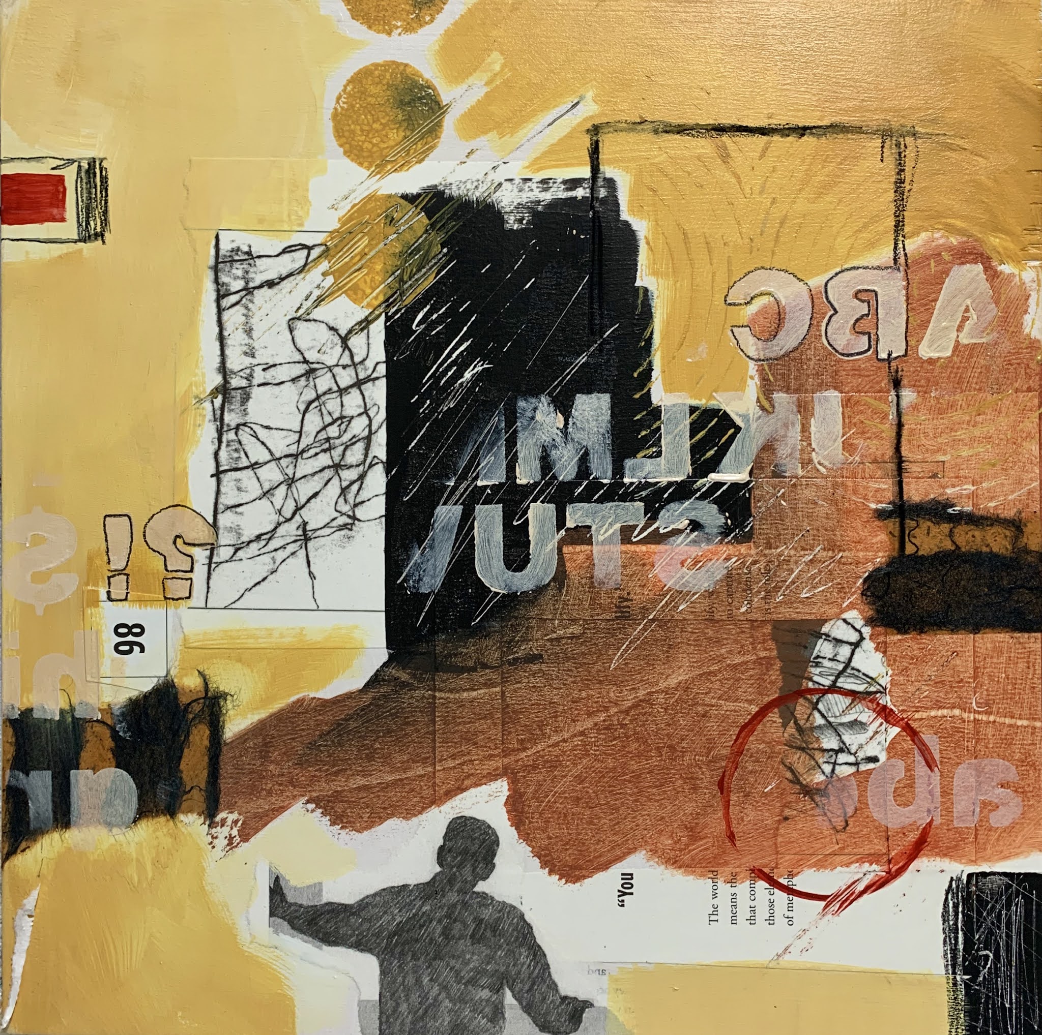
In this piece I've circled the elements I adjusted or added after looking at this piece in black and white and making the adjustments. The large black shape in the middle gets your attention because it's the darkest shape in the painting, so I made sure to add that dark value in different sizes and shapes to keep your eye moving around the painting and making the design much better.

Below was so obvious I can't believe I missed it...how about that little hook shape right in the center...not good! This is already a black and white painting...and if you're like me, I can see changes that need to be made better, by looking at a photo of the piece on my computer...changes the bare eye for some reason cannot see looking directly at the piece. So I eliminated that shape completely, added a few more darks in different sizes and shapes and now my eye doesn't get stuck in the middle with that hook.


So there you have it...if you didn't know, now you know an easy way to look at your art and improve the design...or maybe like me, you just needed a reminder. I love doing this and seeing art in a different light (and dark) and having this tool in my art box to help work out a better painting. The beautiful thing is this little tip works whether you paint abstract of representational art.


Your tutorial is so very, very helpful and spot on. Thanks for taking the time to illustrate so thoroughly. Really good stuff Denise!
ReplyDeleteThanks Don...it took me some time to catch on to this easy tip...now that I have it though its one of favorite my useful go to's. Thanks for checking it out!
DeleteAnother great idea!
ReplyDeleteGlad you're catching up...love seeing you show up here!
Delete